This week I presented a data visualization talk, and had the excuse to discuss the world’s most poorly named chart: The tree map.
I say excuse because I frankly think what I did was wonderful. A decade ago I named the tree map what it was always meant to be: The brownie chart. I’ve regretted many things in the time since, but I never regretted that scrappy act of rebranding. Consider the tree map:
Does that look like a tree to you? Of course not. But a pan of multi-colored brownies? You bet. And Yes please.
I explained to my audience that calling it a brownie chart adds it to the small but growing pantheon of carb-based area charts.
When you want to express areas as parts of a whole, before the tree map you had two choices: the pie chart and doughnut chart. Each has a problem, and I’m not alone in pointing this out. Neither is good at efficiently comparing many different areas. So now, instead, I give you the brownie chart:
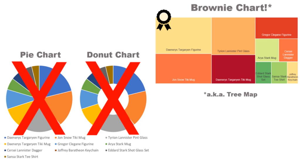
And by efficiently, I’m specifically referring to the fact that the circular office break-room staples force readers to repeatedly leap back-and-forth from the chart and the legend. Or, for instances where the “slices” are labeled, just making sense of all of them!
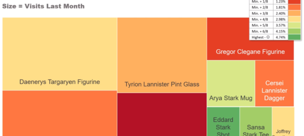
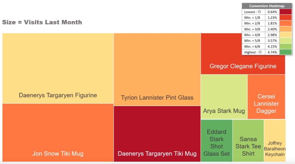
The brownie chart fills a rectangular space, which gives far more information — literal real estate — in rectangular computer monitors, cell phones, and most rarely today, printed pages. The brownie chart also gives readers another dimension of information. In the example above, I was able to express conversion levels using a heat map.
So when your colleagues suggest a pie chart or doughnut chart, present to them an oven-fresh brownie chart!